

Social Graphics for Service Businesses Without a Designer
- 0
- Share


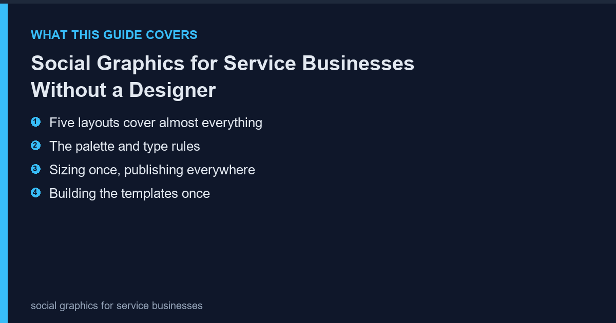
Service businesses post inconsistently because every image starts from a blank canvas. A small template system removes the decision-making: five layouts, two fonts, one palette, and the posting becomes a five-minute task instead of an afternoon.
Five layouts cover almost everything
Most social posts fall into five types: quote, tip, before-after, announcement and testimonial. One layout per type is enough. More layouts create choice paralysis, which is exactly the problem the system is meant to solve.
- Quote: large text on a plain background
- Tip: numbered text with a small graphic element
- Before-after: two images side by side with a divider
- Announcement: headline plus date block
- Testimonial: quote plus a small portrait
The palette and type rules
Two colours, one accent, one typeface in two weights. That is the entire system. Consistency is what makes a small account look established, and it costs nothing to maintain once written down.
| Element | Rule |
|---|---|
| Background | One colour for 80% of posts |
| Accent | One colour, used sparingly |
| Typeface | One family, regular and bold |
| Text size | Large enough to read at 320 px wide |
Sizing once, publishing everywhere
Build at 1080 by 1350 (4:5) and crop to square for grid placements. Building at square first and cropping to portrait loses the composition; the reverse works because there is more room to crop.
| Platform | Ratio | Canvas |
|---|---|---|
| Instagram feed | 4:5 | 1080 x 1350 |
| Instagram grid | 1:1 | 1080 x 1080 |
| Stories | 9:16 | 1080 x 1920 |
| 1:1 or 4:5 | 1080 x 1080 |
Building the templates once
Create the five layouts as saved files with placeholder text. Duplicate, replace the text, export. The free PhotoScape editor keeps the canvas size, margins and export settings identical across duplicates, which is the part that usually drifts when people rebuild from scratch each time.
- Save one master per layout
- Fixed margins, no drag-positioned elements
- Export preset matching the platform size
The posting rhythm
Two posts a week beats seven in one day and nothing for a month. Batch the images monthly, schedule them, and keep one slot free for timely content. The system exists to make the baseline effortless so the exceptions get attention.
- Batch monthly, publish twice weekly
- One slot reserved for reactive content
- Reuse the best performer every quarter
What not to automate
Do not template the testimonial photographs or the before-after pairs. Those are evidence, and evidence that looks templated stops being persuasive.
Frequently Asked Questions
Do I need a design tool?
No. A desktop editor with fixed canvas sizes handles all five layouts, and the files stay on your machine.
How many colours is too many?
More than three, including the background, is too many for a small account.
Should text be on every image?
On most, yes, but not all. An occasional image with no text breaks the pattern and performs well.
What about video?
Use the same palette and typeface as title cards so video and stills look like one account.
Never Miss a Story!